KRAFT Website

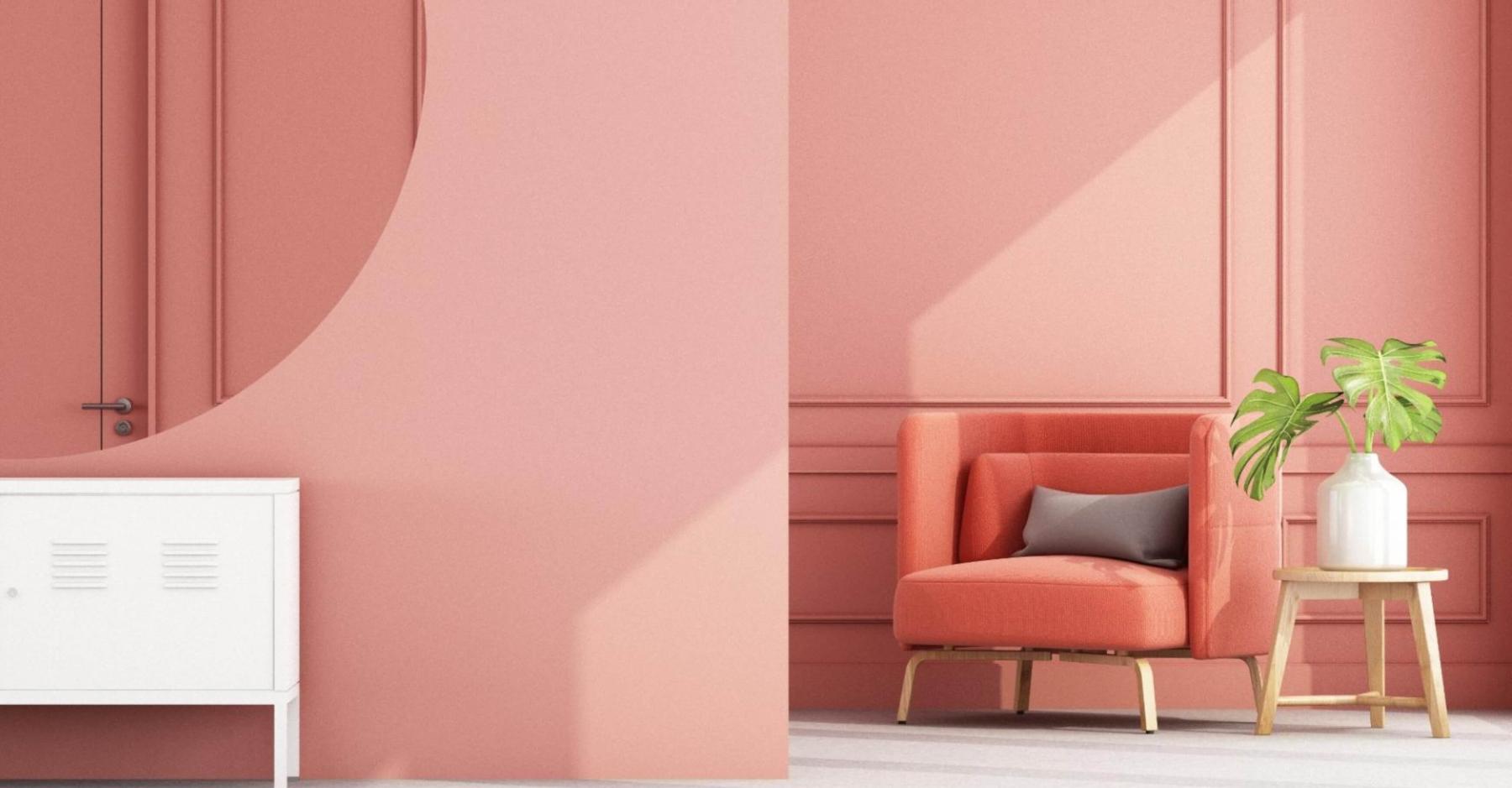
KRAFT Paints’ website: Coloring beyond the UI & UX lines
Driven by groundbreaking creativity and a passion for distinctive colors, KRAFT Paints is a visionary Greek company specializing in architectural paints, enamels and building materials. Its mission? To be a customer-focused pioneer, leading with expertise, quality, value and safety in the industry.
As for us... Color? It’s our muse. Pioneering companies? That’s our niche!

The challenge:
KRAFT entrusted us with their dream. A dream of a website that resonates with B2B and B2C crowds, especially professional painters, architects, store owners, manufacturers, homeowners and DIY enthusiasts. A place where innovation and color are honeymooning, and the journey from visualizing a shade to the right product is all smooth sailing!
Our goals were as follows: to revolutionize how users perceive color and understand its impact on their daily lives. We aimed to make it super easy for everyone to picture new colors in their own spaces, turning those "what if" ideas into real-life vibes. We also set out to create a go-to spot where anyone can find useful info that answers their questions. Most importantly, our mission was to blend the needs of all these different folks into one site, making everyone feel right at home without any clashes.
And did we mention the vast ocean of old and new content sections we had to harmonize and structure? Pheww...! Which begs the question, how did we bridge the gap between an unstructured plethora of information and user-friendly experience?
The approach:
Our strategy was both straightforward and detailed: create a simple-to-use hub where both B2B and B2C users can explore the wide variety of their products, learn how to use them effectively and effortlessly visualize how they will transform their spaces. Ok, it's go time. First was the discovery of ALL the audiences, their needs and objections, then answering each one through careful information architecture and wireframing. It all came together with our tailored design, that gave life to our project through color and innovation!
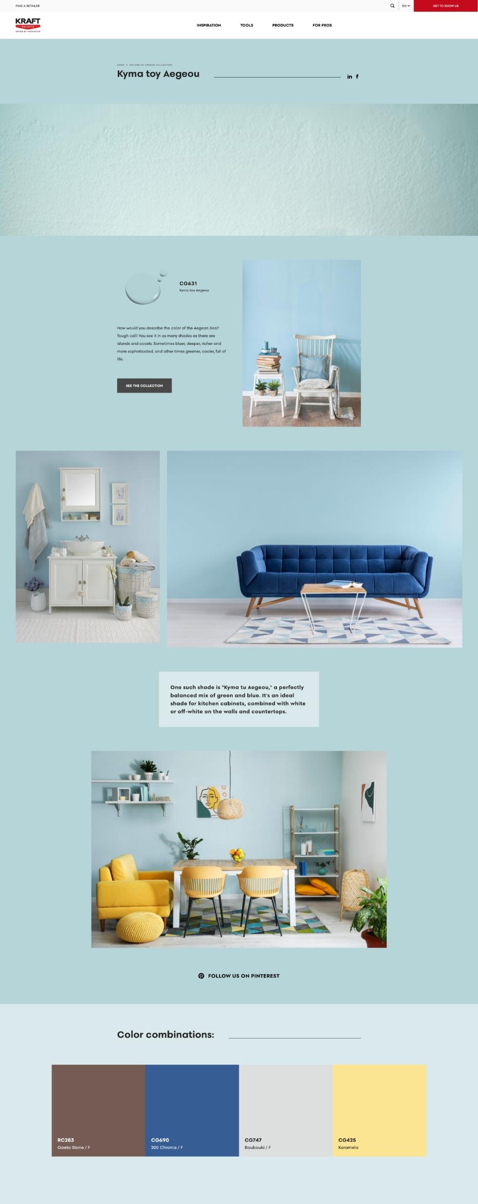
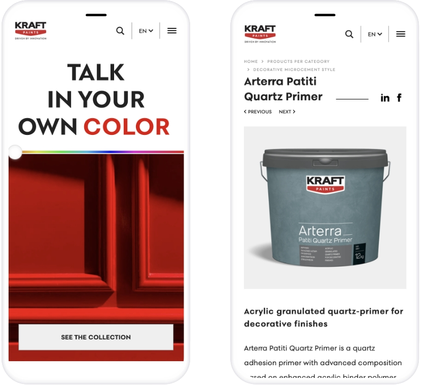
We structured mechanisms, such as responsive and interactive fandecks and presentational landing pages where B2C users can find their desired shade, or even get suggestions regarding trending shades and their application. Rich informational pages provide solutions to issues about painting, give useful tips, or show how colors can transform spaces and blend with other shades. Plus, the "Partner Network" saves B2C users’ time by letting them effortlessly find a nearby retailer.
For their B2B audiences, we've created dedicated spaces with valuable information tailored to their needs and inquiries, as well as a useful download center. Therefore, we've expanded the possibilities by offering tools and resources that elevate their projects, ensuring they have everything they need in one place. There's even a section dedicated to showcasing projects in collaboration with pros, highlighting their exceptional work!
Lastly, during the website re-design and the SEO migration from kraftpaints.gr to kraftpaints.com, we made sure to map and redirect URLs to retain link equity and ensure a seamless transition. It was a SUCCESS! :)
The solution:
And voilà! What we promised, it’s all IN. From INformation and INspiration to INteraction, we’ve painted a world where good ol’ color fuses with INnovation, making a splash in the INdustry! *Copywriter is having a moment*
We delivered a website made with lots of care and hard work, addressing all the needs and concerns of its many audiences. The result is a colorful digital “home” that not only showcases the company’s products and values, but also serves as an informative and handy tool for everyone. Users are now navigating deeper, engaging with shades, advice, trends, and resonating with the essence of KRAFT. I mean, not to toot our own horn, but... *toot*!

The results:
The project was brought to life, launched and validated, not just by our client, but also by the experts. Crowned with the Gold Award in the "Website" category at the Indie Awards 2024, it rewarded our efforts. Yay!
As far as SEO goes, our hard work resulted in sustained traffic, high user engagement and rock-solid search engine rankings. And what is more, we didn't just maintain the rankings, we boosted total ranking keywords year-over-year! From May 2023 to May 2024, the total ranking keywords on Google increased by 18%. Even better, non-branded keywords in the top 3 positions skyrocketed with a 58% boost in search volume. And it won’t stop going up!
