Vikos Website

The brand new Vikos website: From spring to screen
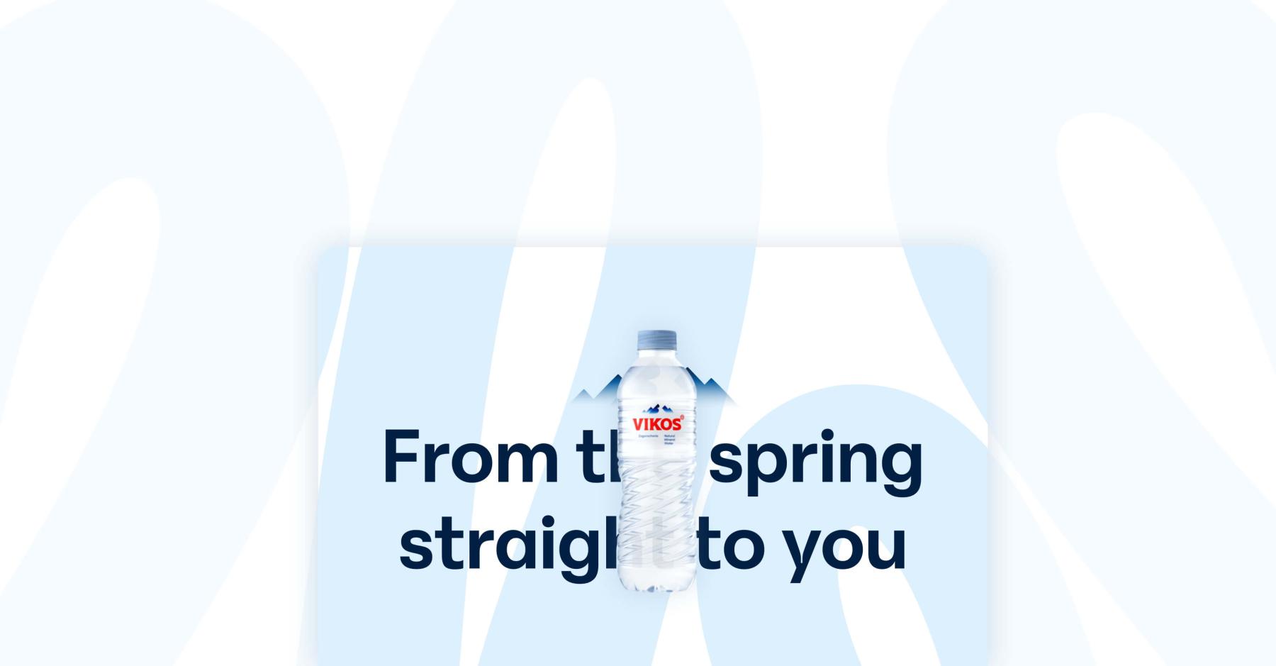
Committed to quality and sustainability, they bring nature’s best to your glass. Epirotic Bottling Industry S.A. is the proud company behind the renowned Vikos natural mineral water, that comes “from the spring, straight to you”. A traditional company with a knack for innovation and forward-thinking, they’re making waves in the bottling and beverage industry.

The challenge:
When Epirotic Bottling Industry S.A. rebranded, they had a new vision: a fresh and engaging website for Vikos natural mineral water, under a new domain, that appeals to both the end consumer and their B2B audience. They needed a site that highlights the water’s purity and natural origins while making a strong first impression. What does that mean for us then?
Well, our job was first to strategically migrate it, make it modern, user-friendly and visually striking. Embodying the company's dedication to quality and sustainability, while differentiating them from the competition. *Not done* We also needed to highlight the deep connection of the brand with nature, ensuring that every aspect of the site reflected this intrinsic bond. Easy-peasy-lemon-squeezy-NOT. We loved it. We shook hands on it. (Probably, I wasn’t there.)
The approach:
We started by diving deep into stakeholder interviews to get a solid grasp of the company’s identity and goals. Then came an intensive UX Workshop where we mapped out their new objectives, audience segments and brand values. We came up with a plan. Create distinct websites for each target audience: vikos.com for the natural mineral water and the brand microsites for Vikos Cola, Soft Drinks and Mixers, as well as a corporate site (epirotic.com) for the company. But right now, let’s focus on vikos.com.
So, we designed wireframes that emphasized easy navigation and compelling storytelling. Simply showcasing the products just wasn’t enough for us. We crafted fresh, bilingual and undeniably heartfelt content to perfectly match and narrate the new brand identity. The UI design was also a key focus - we went for a clean, fluid aesthetic, that's both visually appealing and incredibly intuitive. Every detail, from custom visuals and their placements, to buttons that come to life when messed with, to "floating” animations, was meticulously crafted to boost user interaction and keep the experience smooth and enjoyable.
It began to emerge as a digital masterpiece. Each page is a chapter of a larger story, each click a part of the journey, pulling you deeper into the Vikos narrative, making sure that vikos.com doesn’t just reach you - it stays with you.
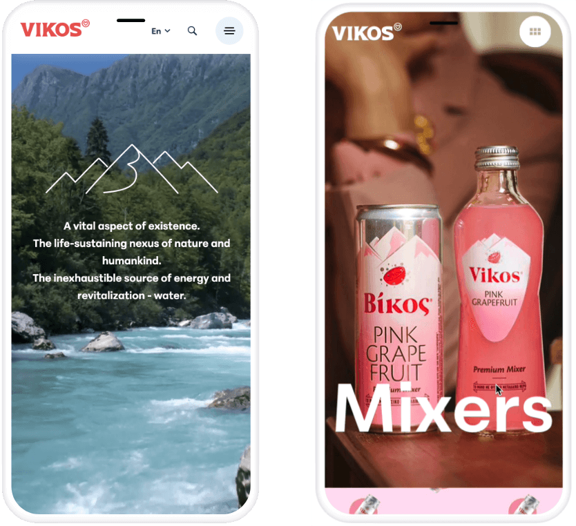
As for the brand microsites under vikos.com, it’s a different but equally exciting story! We went all out to make them uniquely awesome, tailored to their target audiences. They feature horizontal scrolling, showcasing all the packaging options and product information in a visually striking way. Each scroll is fun, packed with cool micro-animations and bright colors that draw you in and keep you going!

The Solution:
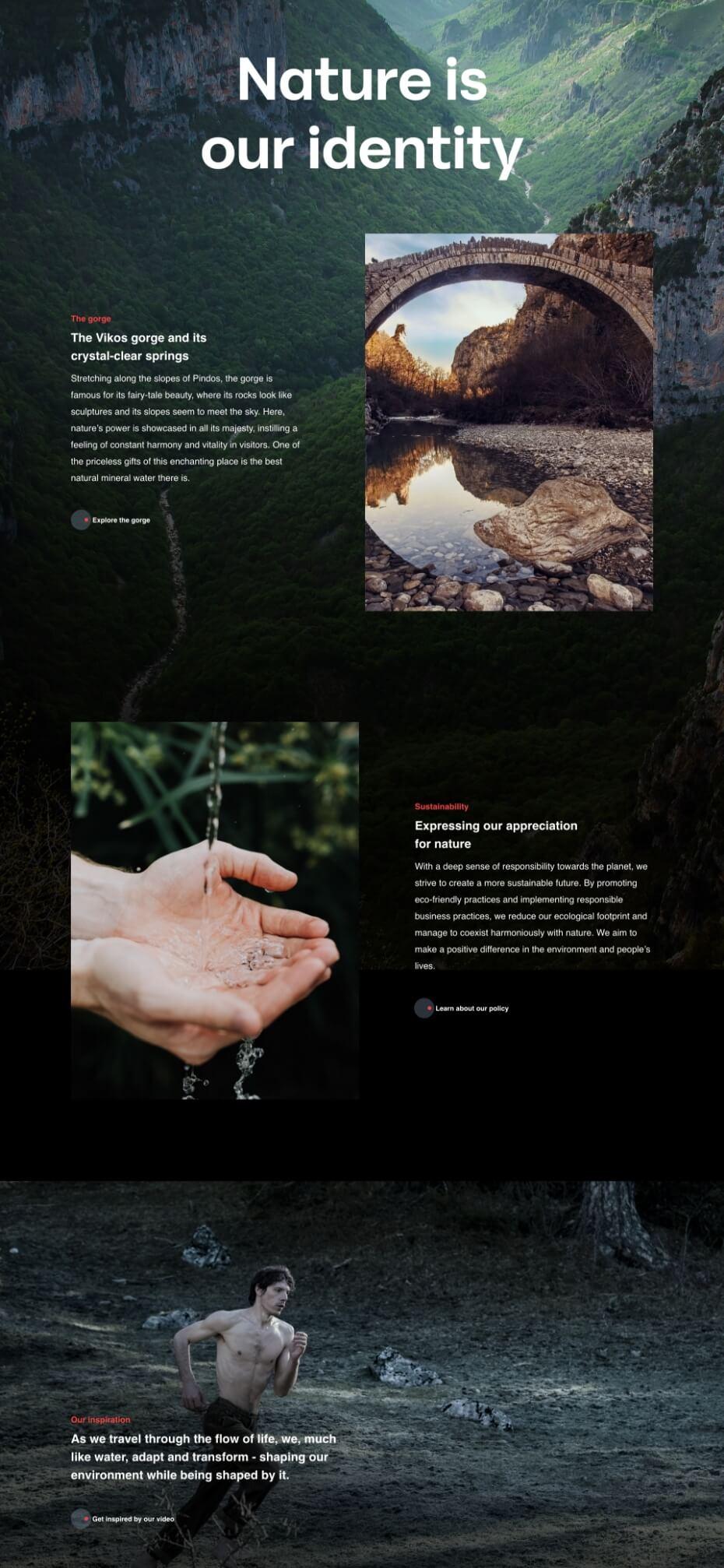
We organized the site into clear, engaging sections, showcasing the water’s origin and benefits, the details on every packaging, the B2B side of the business and the company’s eco-friendly efforts and CSR initiatives. The homepage greets visitors with striking visuals that tell the story of Vikos natural mineral water from spring to glass. In the SEO process, we nailed it with thorough redirects and spot-on keyword research. This ensured a smooth transition without any ranking dips, keeping the brand's online presence strong and steady.
The website flows naturally, mirroring the flow of water, with smooth animations and intuitive navigation being just the tip of the iceberg. We’re talking about a whole experience that translates quality and pureness in our mother tongue - the digitalish. Oh, and we DID highlight the deep and direct connection of the brand with nature. It was literally the whole point. Happy clients, happy life! Or something. We were happy, the clients were happy, and judging by the traffic, visitors are happy, too! ;)
