Vechro

Vechro’s corporate Website: Color bombed UX & UI design
70 years old with a young heart and forward-looking mindset, Vechro, is one of the largest paints and varnish manufacturers in Greece. This is a company that has invested in ecofriendly products aiming towards a more sustainable environment. Please note we’re talking about paint. Yes, COLORRR! Lots and lots of it! We loved it. We worked it full on!
The challenge:
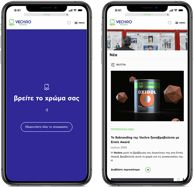
Our client desired a site that speaks to the average homeowner, the professional painter, the shop owner, the DIYer. Luckily, we here at DOPE are experts when it comes to tailoring experiences to different personas. Also, some digital renovations and brand image boosting were desperately needed. Again, we here at DOPE live for this kind of stuff! Vechro’s new responsive website was to be a Colorfest of crisp modern aesthetics infused with optimized UX and beautifully blended content that visitors could easily navigate through on any device. At the same time, we wanted to highlight the company’s background and its evolution over the years, especially the fact that it’s a Greek family business with a green philosophy. Still, there was a lot of work to be done… Seriously, we had to find a way to restructure loads of information to make it clear while boosting online sales while rethinking the MyVechro application while upscaling the Paint Calculator tool….AND, help out the content editors and administrators by making sure they could easily move around the site’s nooks and crannies and, you know, do their thing. Gee whiz- you get the picture! Curious to find out how we managed it all? Stay with us for just a tad of scrolling!
The approach:
How do you maintain balance in a site bustling with inspiration, tips, product catalogs, tools, and sooo much more? You don’t actually need to answer that, because- well we did- and we made it happen for our bright and colorful client. It goes like this:
Several stakeholder interviews later, we identified the different personas that make up the site’s visitors. Then, we analyzed them in our top-secret disguised DOPE Lab (nah, just messing with ya)! However, we did identify their needs and desires based on in-depth research.
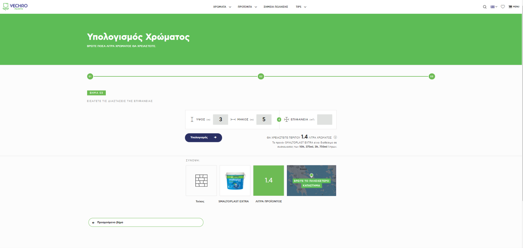
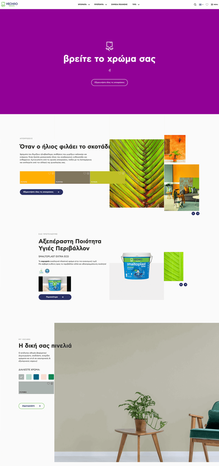
This would be our guide map for starting the site’s content reconstruction. Naturally, Color was the star of this digital venture, which resulted in a highly engaging interactive mini-app, placed center stage of the site, that helps users instantly choose their preferred color, shade, and product.
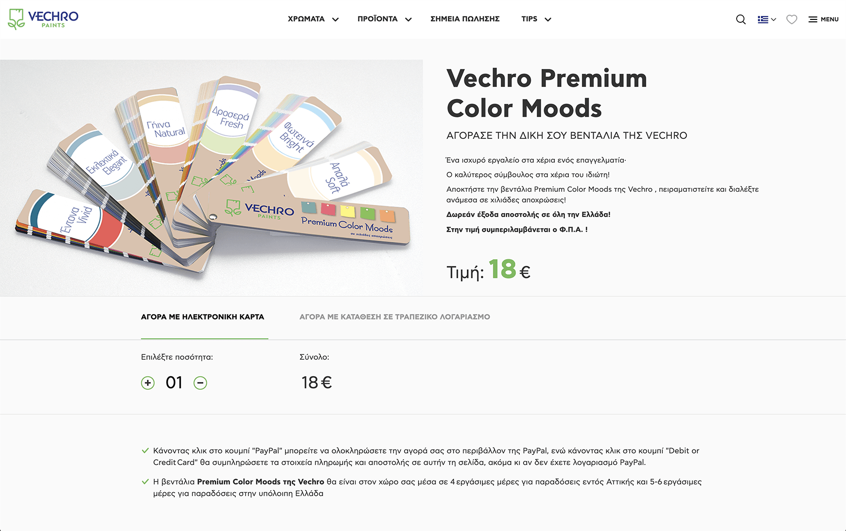
We redesigned the Timeline page, allowing space for more text and larger images. Also, we created separate sections for Catalogs, Colors, and Shades under a structure that helps users understand what they are looking for and where they will find it. It’s never any fun if you feel lost in a website of jargon, right? Anyway, moving on…! Plus, we created a purchase page through which one can make a direct purchase; basically, all transactions fall into the admin lap, and from there the commercial department can monitor them, just like a regular shop.
And of course, we made sure the new corporate identity of the organization was polished and evident, with all the fresh new brand colors masterfully blended into the design (you know, for a greater impact). We used a platform (Drupal 8) because it would best facilitate all the above but, most importantly, it majorly simplified content management, which in turn saved the administrators tons of time- even from day one!
The Solution:
As far as looks are concerned, this is a site matched for its audience; it highlights key products and brand values, all neatly arranged in a modern digital showroom. A handy showroom, that instantly became a tool both for individuals interested in painting their home and for painters or shopkeepers seeking technical information about products. Traffic wise, the Shades page is super busy, with an average page session counted in minutes, as opposed to seconds! Another sweet fact is that practically as soon as the website went live, color palette sales fired up, even without a campaign. Besides, MyVechro was immediately appreciated by the company and utilized as an important marketing tool. Likewise, the Calculator’s story is all about traffic getting nicely heavy ;) Put simply, we delivered a living site with everchanging content; a site that smoothly evolves from day to day, expanding and enchanting known and new visitors by the minute!